
'input-knob.js' is here : input-knobs.js
GitHub repository : https://github.com/g200kg/input-knobs
Features
input-knobs.js is a Javascript library for Rotating Knobs / Horizontal & Vertical Sliders / Toggle Switches / Radio Buttons style GUI widgets.
This is a sub-set of 'webaudio-controls''
and simply replace the appearance of <input/> tags to rotating knobs, sliders or switches.
Since 'webaudio-controls' uses WebComponents, Firefox / Edge etc requires polyfill,
but due to the rewriting of the basic structure of DOM, problems may occur with API which take DOM element directly as argument.
input-knobs.js is not full compatible to 'webaudio-controls' but this problem can be avoided.
input-knobs.js は回転するノブ、水平および垂直のスライダー、トグルスイッチ、ラジオボタン型の GUI ウィジェットの Javascript ライブラリです。
これは 'webaudio-controls' のサブセットで、単純に <input/> タグの外見を
回転するノブやスライダー、スイッチに置き換えます。
'webaudio-controls' は WebComponents を使用するため Firefox / Edge 等ではポリフィルが必要になりますが、
DOM の基本構造を書き換える影響で DOM エレメントを直接引数に取る API 等で不具合が生じる場合があります。
input-knobs.js は 'webaudio-controls' の機能の全ては揃っていませんがこの問題を避ける事ができます。
| Tag | Change to |
|---|---|
| <input type="range" class="input-knob"/> | Rotating Knob |
| <input type="range" class="input-slider"/> | Horizontal Slider |
| <input type="range" class="input-slider"/> | Vertical Slider |
| <input type="checkbox" class="input-switch"/> | Toggle Switch |
| <input type="radio" class="input-switch"/> | Radio Button |
- Easy to use by place and load just one file `input-knobs.js`.
- Compatible with Chrome / Firefox / Safari / Edge.
- Lightweighted. No other libraries are required.
- 'input' and 'change' events are fired same as normal input tags.
- Work even under 'file:///' protocol.
- Touch devices support.
- 単一のファイル `input-knobs.js` を配置して読み込むだけで簡単に使用できます
- Chrome / Firefox / Safari / Edge で動作します
- 軽量です。他のライブラリを必要としません
- 通常の input タグと同様に 'input' および 'change' イベントを発火します
- 'file:///' プロトコル上でも使用可能です
- タッチデバイスでの動作も可能です
Usage
- In the case of bower, use the command `bower install --save g200kg/input-knobs` from the console. Or just download input-knobs.js
- Place `input-knobs.js` to appropriate folder
- Load `input-knobs.js` :
<script src="input-knobs.js"></script> - Add class 'input-knob', 'input-slider', 'input-switch' to input tag in your HTML.
- Some optional attributes (data-*) are also available for customize
- Event handling, get / set current value are similar to ordinary input tags. However, if you change the size or color of an element after generated, explicit element.refresh() function call is needed for update display.
- bower の場合はコンソールからコマンド `bower install --save g200kg/input-knobs` を使用してください。 あるいは単に `input-knobs.js` をダウンロードしてください
- `input-knobs.js` を適切なフォルダに配置してください
- `input-knobs.js` をロードします :
<script src="input-knobs.js"></script> - HTML の 'input' タグに適宜クラス 'input-knob'、'input-slider'、'input-switch' を追加します
- 更に幾つかの属性 (data-*) を追加してカスタマイズする事もできます
- イベントのハンドリングや現在の値の取得、設定等は通常の input タグと同様です。 ただしエレメントのサイズや色を生成後に変更する場合は element.refresh() 関数を明示的に呼び出して表示を更新する必要があります
Operation
There are some tips for knobs and sliders operation :
ノブおよびスライダーの操作方法に幾つかの Tips があります :
| Operation | Description |
|---|---|
| Mouse dragging | Upward / Right for increase value, Downward / Left for decrease value |
| ShiftKey + dragging | Fine adjustment, 1/5 sensitivity to mouse movement |
| Mouse Wheel | Upward : increase value Downward : descrease value |
| ShiftKey + Mouse Wheel | Fine adjustment, 1/5 sensitivity to wheel movement |
| Keyboard (after focused) | Up / Right arrow : increment value Down / Left arrow : decrement value |
| 操作 | 説明 |
|---|---|
| マウスドラッグ | 上または右方向で値を増加 下または左方向で値を減少 |
| Shiftキー + マウスドラッグ | 微調整。マウスの移動に対する感度が 1/5 になります |
| マウスホイール | 上方向 : 値を増加 下方向 : 値を減少 |
| Shiftキー + マウスホイール | 微調整。ホイールの動きに対する感度が 1/5 になります |
| キーボード (フォーカスを当てた後) | カーソル上または右 : 値を1ステップ増加 カーソル下または左 : 値を1ステップ減少 |
Attributes
| Attribute | Description |
|---|---|
| data-diameter = "nnn" | Set the width and height of the knobs or switches in 'px'. This is equivarent to 'data-width="nnn" data-height="nnn"'. In default, 64 for knobs and 32 for switches. |
| data-width = "nnn" data-height = "nnn" |
Set the width and height of the knobs, sliders or switches individually in 'px'. In default, 64 for knobs, 128 for sliders and 32 for switches. If the size for slider is vertically long, the slider will be a vertical slider. |
| data-src = "Image URL" | Use external image for the knobs/switches. For Knobs, the image should be single knob-image that pointing upward (12 O'clock), or a vertically stitched knob-images that represent rotation of the knob frame by frame. For Sliders, the image should be a vertically stitched slider-images that represent thumb sliding from min value to max value frame by frame. For Switches, this image should be a vertically stitched Off state and On state image. If no image is supplied, input-knobs uses knob/slider/switch images embedded inside (black body and red indicator) |
| data-sprites = "nnn" | For Knob / Sliders only. If you use frame stitched knob/slider-image,
this attribute should be the number of frames - 1.
The knobs that specified 'data-src' but not specified this attribute, it will use image rotation instead of frame switching procedure. The sliders that specified 'data-src' but not specified this attribute, the image is used as slider thumb part and the background is filled by 'data-bgcolor' . |
| data-fgcolor = "color" | Change Knob / Slider / Switch 's pointer color when no external image (data-src) is used. Default is red "#f00". |
| data-bgcolor = "color" | Change Knob / Slider / Switch 's background color when no external image (data-src) is used. Default is black "#000". |
| 属性 | 説明 |
|---|---|
| data-diameter = "nnn" | ノブ、スイッチのサイズを 'px' で指定します。これは'data-width="nnn" data-height="nnn"' をまとめて指定する事と等価です。デフォルトではノブは 64、スイッチは 24 になっています。 |
| data-width = "nnn" data-height = "nnn" |
ノブ、スライダー、スイッチの幅および高さを 'px' で指定します。デフォルトではノブは幅、高さ共に 64、スイッチは幅、高さ共に 24 です。 またスライダーのデフォルト値は幅 128、高さ 20 です。スライダーで指定された形状が縦長の場合、自動的に垂直スライダーとなります。 |
| data-src = "Image URL" | ノブ、スライダー、スイッチに外部の画像を使用します。 ノブの場合、この画像は真上(12時の方向)を指した単一の画像、または最小値から最大値までの回転をあらわすコマ毎の画像を縦方向に繋げた画像です。 また、スライダーではツマミ部分の1枚の画像または、最小値から最大値までのスライドをあらわすコマ毎のスライダー全体画像を縦方向に繋げた画像を指定します。 スイッチの場合、この画像はオフ状態とオン状態の画像を縦方向に繋げた画像でなくてはなりません。 画像が指定されない場合は、input-knobs は内部に保持しているノブ/スライダー/スイッチの画像(黒い本体に赤いインジケータ)を使用します。 |
| data-sprites = "nn" | ノブおよびスライダーの場合のみ使用します。
ノブ/スライダーの画像として複数のフレームを繋いだ画像を使用する場合、この属性でフレームの数を指定しなくてはなりません。
指定する数 "nn" は フレームの数 - 1 です。
data-src を指定したノブでこれを指定しない場合は、1枚の画像を回転させる動作となります。 data-src を指定したスライダーでこれを指定しない場合、画像はスライダーのツマミ部分だけを表す画像として使用され、背景は黒または 'data-bgcolor' で塗りつぶされます。 |
| data-fgcolor = "color" | 外部画像(data-src)を使用しない場合のポインター部分の色指定です。デフォルトは赤 #f00 になっています。 |
| data-bgcolor = "color" | 外部画像(data-src)を使用しない場合、およびスライダーで 'data-src' をツマミ部分だけに使用する場合の背景の色指定です。デフォルトは黒 #000 になっています。 |
inputKnobsOptions
グローバルなオブジェクト window.inputKnobsOptions を定義する事により、個別のタグで 'data-*' 属性を設定しない場合のデフォルト値を設定しておく事ができます。 例えば次の行をHTMLファイル内に記述しておく事で、ポインター色、背景色、ノブの直径のデフォルト値を変更できます。
By defining the global object `window.inputKnobsOptions`, the default values of each attribute are set. These values are used when no 'data-*' attributes are specified in each tag. For example, following line in the HTML file will set the pointer color, the background color, and the knob diameter.
<script>window.inputKnobsOptions={fgcolor:"#00ff00",bgcolor:"#000080",knobDiameter:"48"}</script>
次の表の項目が inputKnobsOptions で設定できます。
The items in the following table can be set with inputKnobsOptions.
| Key名 | 説明 |
|---|---|
| knobDiameter | ノブの直径 |
| knobWidth | ノブの幅、これは knobDiameter よりも優先します |
| knobHeight | ノブの高さ、これは knobDiameter よりも優先します |
| sliderWidth | スライダーの幅 |
| sliderHeight | スライダーの高さ |
| switchDiameter | スイッチの直径 |
| switchWidth | スイッチの幅、これは switchDiameter よりも優先します |
| switchHeight | スイッチの高さ、これは switchDiameter よりも優先します |
| fgcolor | インジケータ部の色 |
| bgcolor | 背景の色 |
| Key | Description |
|---|---|
| knobDiameter | Diameter of knobs |
| knobWidth | Width of knobs that takes prioriry over knobDiameter |
| knobHeight | Height of knobs height that takes priority over knobDiameter |
| sliderWidth | Width of sliders |
| sliderHeight | Height of sliders |
| switchDiameter | Diameter of switches |
| switchWidth | Width of switches that takes priority over switchDiameter |
| switchHeight | height of switches that takes priority over switchDiameter |
| fgcolor | Indicator color |
| bgcolor | Background color |
Functions
element.refresh()
input-knobs を適用した DOM エレメントに対し、生成後にサイズや色を変更した場合はこの関数を読んで表示を更新する必要があります。
If you change the size or color after DOM element with input-knobs is generated, this function call is needed for update the display.
    let elem=document.getElementById("knob1");  // get existing input-knob element
    elem.setAttribute("data-diameter","40");    // set the diameter to "40"
    elem.refresh();                             // update display
Knob Samples
This is a usual <input type="range"/>. class 'input-knob' makes change this to rotating knob.
これが通常の <input type="range"/> です。 'input-knob' クラスはこれを回転するノブに置き換えます。
Simplest
Just add the class "input-knob" to <input type="range"> tag. This behave same as normal <input type="range"> tag except for appearance and mouse operation.
単に "input-knob" クラスを <input type="range"> タグに追加します。 これは見た目とマウス操作方法以外は通常の <input type="range"> タグと同様の動作をします。
<input type="range" class="input-knob"/>
Diameter Variation
You can customize the knob size by attribute 'data-diameter'.
ノブのサイズを 'data-diameter' 属性でカスタマイズする事ができます。
<input type="range" class="input-knob" data-diameter="120"/>
<input type="range" class="input-knob" data-diameter="60"/>
<input type="range" class="input-knob" data-diameter="32"/>
Color Variation
You can customize the knob color by attribute 'data-fgcolor' and 'data-bgcolor'.
ノブの色を 'data-fgcolor' および 'data-bgcolor' 属性でカスタマイズする事ができます。
<input type="range" class="input-knob" data-fgcolor="#00ff00"/>
<input type="range" class="input-knob" data-bgcolor="#406080"/>
<input type="range" class="input-knob" data-bgcolor="#2040c0" data-fgcolor="#ffc080"/>
With External Knob Image

The knob image can be specified with 'data-src' attribute.
This image is a simple single knob-image that pointing upward.
Image is automatically resized to 'data-diameter' size.
'data-src' 属性でノブの画像を指定する事ができます。
この画像は単に真上を向いた1枚のノブ画像です。
画像は自動的に 'data-diameter' の大きさにリサイズされます
<input type="range" class="input-knob" data-diameter="96" data-src="./images/knobman96.png"/>
With Multi Frame External Image

The image specified with 'data-src' attribute can be a vertically stitched multi-frame image that represent knob rotation.
In this case, 'data-sprites' attribute should be the number of frames - 1.
JKnobMan / WebKnobMan may be a help for making these stitched images,
'data-src' 属性で指定する画像として、ノブの回転をあらわす複数のフレームを繋いだ画像を使用できます。
この場合、'data-sprites' 属性でフレームの数を指定します。
このフレームを接続した画像を作成するには JKnobMan / WebKnobMan が役立つかも知れません。
- JKnobMan -- Java based Knob image creation tool.
- WebKnobMan -- WebApp version of the JknobMan
- KnobGallery -- knob data sharing space
- JKnobMan -- Java 版ノブ画像作成ツール
- WebKnobMan -- JKnobMan の WebApp 版
- KnobGallery -- ノブデータのシェアリングスペース
<input type="range" class="input-knob" data-diameter="120" data-src="./images/knob70.png" data-sprites="100"/>
<input type="range" class="input-knob" data-diameter="60" data-src="./images/knob70.png" data-sprites="100"/>
<input type="range" class="input-knob" data-diameter="32" data-src="./images/knob70.png" data-sprites="100"/>
Events Handling
'input' events are fired while dragging, 'change' event is fired when mouseup.
Usual attributes like 'min', 'max', 'step' are also effective.
ドラッグ中は 'input' イベントが発火し、mouseup の時に 'change' イベントが発火します。
'min'、'max'、'step' 等の通常の属性も有効です。
<input type="range" class="input-knob" min="-10" max="10" step="0.1"
   oninput="inputEventHandler(this)" onchange="changeEventHandler(this)"/>
Slider Samples
Simplest
Just add the class 'input-slider', it is a width 128px, height 20px horizontal slider.
単にクラス 'input-slider' を追加した場合、width は 128px、height は 20px の水平スライダーになります。
<input type="range" class="input-slider"/>
Size Variation
You can customize the slider size by attribute 'data-width' and 'data-height'. At this time, specifying a vertically long shape will automatically become a vertical slider.
スライダーのサイズを 'data-width' および 'dat-height' 属性でカスタマイズする事ができます。 この時、縦長の形状を指定すると自動的に縦スライダーになります。
<input type="range" class="input-slider" data-width="300" data-height="40"/>
<input type="range" class="input-slider" data-width="150"/>
<input type="range" class="input-slider" data-width="100" data-height="16"/>
<input type="range" class="input-slider" data-width="40"/>
<input type="range" class="input-slider" data-height="150"/>
<input type="range" class="input-slider" data-width="16" data-height="100"/>
Color Variation
You can customize the slider color by attribute 'data-fgcolor' and 'data-bgcolor'.
スライダーの色を 'data-fgcolor' および 'data-bgcolor' 属性でカスタマイズする事ができます。
<input type="range" class="input-slider" data-fgcolor="#00ff00"/>
<input type="range" class="input-slider" data-bgcolor="#406080"/>
<input type="range" class="input-slider" data-bgcolor="#2040c0" data-fgcolor="#ffc080"/>
With External Image
If an image is specified by 'data-src', it will be used as the slider thumb. The background color can be specified by 'data-bgcolor' attribute.
'data-src' で画像を指定してスライダーのツマミ部分に使用できます。この時、背景部の色は 'data-bgcolor' で指定できます。
<input type="range" class="input-slider" data-src="./images/knobman96.png"/>
<input type="range" class="input-slider" data-width="50"
    data-height="120" data-src="./images/knobman96.png"/>
<input type="range" class="input-slider" data-width="50" data-height="120"
    data-bgcolor="#28f" data-src="./images/knobman96.png"/>
With Multi Frame External Image
As with knobs, you can also create a full custom slider by specifying the multi-frame stitched image to 'data-src' attribute and specifying the number of frames with 'data-sprites'.
ノブの場合と同じようにフレームを接続した画像を 'data-src' 属性で指定して、'data-sprites' でコマ数を指定するとフルカスタムのスライダーを作る事もできます。
<input type="range" class="input-slider" data-width="200" data-height="40"
    data-sprites="50" data-src="./images/slider3.png"/>

Switch Samples
This is a usual <input type="checkbox"/>. class 'input-switch' makes this to a toggle switch.
これは通常の <input type="checkbox"/> タグです。 'input-switch' クラスによってこれをトグルスイッチに置き換えます。
Simplest
Just add the class 'input-switch' :
単にクラス 'input-switch' を追加した場合 :
<input type="checkbox" class="input-switch"/>
Diameter Variation
Switch size is changeable by 'data-diameter' attribute or 'data-width' and 'data-height'.
'data-diameter' または 'data-width' と 'data-height' 属性でスイッチのサイズを変更できます。
<input type="checkbox" class="input-switch" data-diameter="64"/>
<input type="checkbox" class="input-switch" data-diameter="32" checked/>
<input type="checkbox" class="input-switch" data-diameter="16"/>
<input type="checkbox" class="input-switch" data-width="40" data-height="20"/>
<input type="checkbox" class="input-switch" data-width="20" data-height="50"/>
Color Variation
You can customize the switch color by attribute 'data-fgcolor' and 'data-bgcolor'.
スイッチの色を 'data-fgcolor' および 'data-bgcolor' 属性でカスタマイズする事ができます。
<input type="checkbox" class="input-switch" data-fgcolor="#00ff00" checked/>
<input type="checkbox" class="input-switch" data-bgcolor="#406080"/>
<input type="checkbox" class="input-switch" data-bgcolor="#2040c0" data-fgcolor="#ffc080"/>
With External Image
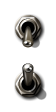
The switch image can be specified with 'data-src' attribute. This image should be a image that is vertically stitched off and on state images. Image is automatically resized to 'data-diameter' size square.
'data-src' 属性によってスイッチの画像を指定する事ができます。 この画像はオフ状態とオン状態を縦方向に繋いだ1枚の画像です。 画像は自動的に 'data-diameter' の大きさにリサイズされます。
<input type="checkbox" class="input-switch" data-src="./images/switch_offon.png" data-diameter="80"/>
<input type="checkbox" class="input-switch" data-src="./images/switch_offon.png" data-diameter="50"/>
<input type="checkbox" class="input-switch" data-src="./images/switch_offon.png" data-diameter="30" checked/>
Events Handling
'change' event is fired when 'checked' state is changed.
'checked' の状態が変化した時に、'change' イベントが発火します。
<input type="checkbox" class="input-switch" onchange="changeEventHandler(this)"/>
Radio Buttons
Class 'input-switch' is also effective for <input type="radio"/> tag.
'input-switch' クラスは <input type="radio"/> タグに使用する事もできます。
<input type="radio" name="group1" class="input-switch"
    data-src="./images/switch_offon.png" data-diameter="80"/>
<input type="radio" name="group1" class="input-switch"
    data-src="./images/switch_offon.png" data-diameter="80" checked/>
<input type="radio" name="group1" class="input-switch"
    data-src="./images/switch_offon.png" data-diameter="80"/>
License
input-knobs.js is released under the MIT License.
Knob/Switch images in samples are from KnobGallery, toggle switch image by az (c) 2011 CC-BY