webaudio-controls
GUI parts library for Web application using WebComponents
Project maintained by g200kg Hosted on GitHub Pages — Theme by mattgraham
Basic Usage :
- Overview
- Install
- How it works
- Detail&Specs
- WebAudioControlsOptions
- Creating Knob Images
- Default Styles
- Attributes Examples
Advanced Usage and Application Notes :
- Knob Samples from KnobGallery
- Working Keyboard Demo
- Determining Knob Size
- Slider tracking "rel" and "abs"
- Non-Linear Knobs / Sliders
- Multi-Touch Device Support
- MIDI Support
- Resizing After Creation
How each Component Works
webAudio-knob
webaudio-knob is used to create a rotating knob. Knobs are displayed in the default state by adding tags as follows on HTML.
<webaudio-knob id="knob1"></webaudio-knob>
<script>
document.getElementById("knob1").addEventListener("input", (event)=>{
  console.log(event.target.value);
});
</script>
<webaudio-knob> and <webaudio-slider> are similar in behavior to the <input type="range"> tag. It has a value in the specified range and can be changed by user operation.
The events are issued by operating this knob with a mouse or touch device, so you can access it through Javascript by assigning ids like normal DOM elements.
Also if you assign a external filmstrip-type image file to a <webaudio-knob> with the src attribute, you can create an frame-by-frame animated knobs that changes not only rotation but changes shapes or colors as the value changes.
<webaudio-knob id="knob2" src="../knobs/lineshadow.png"></webaudio-knob>
webaudio-slider
The <webaudio-slider> is similar to the <webaudio-knob>, but it is a slider that thumb moves horizontally or vertically, rather than a rotary knob.
Horizontal or vertical is automatically determined by the width and height settings. Event handling is the same as for <webaudio-knob>
When specifying the image file, set the background part and the thumb part separately, then the thumb part will move horizontally or vertically on the background part.
  <webaudio-slider id="sli1" width="300" height="30"></webaudio-slider>

  <webaudio-slider id="sli2" width="300"
    src="../knobs/hsliderbody.png"
    knobsrc="../knobs/hsliderknob.png">
  </webaudio-slider>
webaudio-switch
The <webaudio-switch> is a switch with an on/off state and comes in three types: toggle (checkbox), kick (on while pressed), and radio button (only one of the button in the group can be on).
Each type is specified by the type attribute. In the case of a radio button, a group is created using the group attribute.
toggle(default)
kick
radio
<webaudio-switch id="sw1" type="toggle">
</webaudio-switch> toggle(default)<br/>

<webaudio-switch id="sw2" type="kick">
</webaudio-switch> kick<br/>

<webaudio-switch id="sw3" type="radio" group="radio1">
</webaudio-switch>
<webaudio-switch id="sw4" type="radio" group="radio1" value="1">
</webaudio-switch>
<webaudio-switch id="sw5" type="radio" group="radio1">
</webaudio-switch>

<script>
elms=document.getElementsByTagName("webaudio-switch");
for(var i=0;i<elms.length;++i){
  elms[i].addEventListener("change",(event)=>{
    console.log("change", event.target.id, event.target.value)
  });
  elms[i].addEventListener("click",(event)=>{
    console.log("click", event.target.id, event.target.value)
  });
}
</script>
As for the event, "change" is issued when the state changes and "click" is issued when the user clicks on it.
If you want to use an image file, you can set the src attribute to an image that is vertically stitched in the off and on states like:
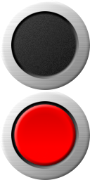
Then you will see the following:
<webaudio-switch src="../knobs/redbutton128.png"></webaudio-switch>
WebAudio-Param
<webaudio-param> is a small text field used to display the current value of <webaudio-knob> or <webaudio-slider>.
Additionally, it allows manipulating the knob or slider value by editing this text field.
The basic behavior of <webaudio-param> does not require any Javascript program; it will work automatically if the link attribute is set to the target knob or slider’s id.
  <webaudio-knob id="knob10"></webaudio-knob>
  <webaudio-param link="knob10"></webaudio-param>
  <webaudio-slider id="slider10"></webaudio-sliderb>
  <webaudio-param link="knob10"></webaudio-param>
webaudio-keyboard
webaudio-keyboard is a tag for creating a music keyboard. It can be played with a mouse or touch device, and also supports multi-touch.
The default display looks like this:
<webaudio-keyboard id="kbd"></webaudio-keyboard>

<script>
  document.getElementById("kbd").addEventListener("change",(event)=>{
    console.log(event.note);
  });
</script>
About event behavior, a "change" event is issued when a key is pressed/released.
This "change" event is accompanied by a note property, which holds the key on/off state and note number. (Note that the note property is attached to the event object, not the webaudio-keyboard element.)
You can specify the width, height and number of keys. In addition, the note of the lowest key can be specified with min attribute.
<webaudio-keyboard width="800" height="40" keys="88" min="9">
</webaudio-keyboard>